Visualization is an important way to make sense of data and draw informative and actionable insights. A good visual lets the reader get a basic sense of the information with just a glance.
A popular visualization used to view data is a heatmap. In this article, I will explain a heatmap and how to create one in Python using Matplotlib, Seaborn, and Plotly.
What Is a Heatmap?
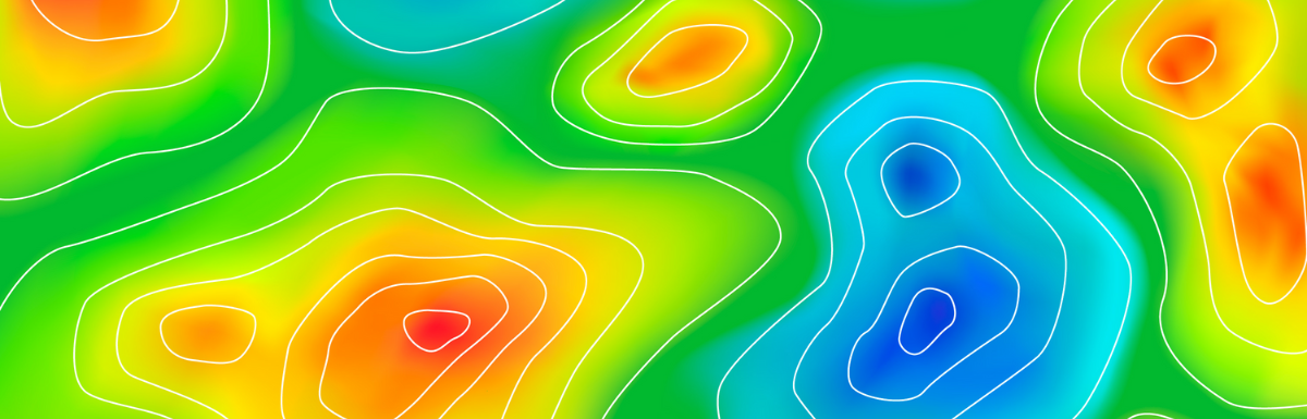
A heatmap is a 2-dimensional image representing data as a matrix or grid of points. A shade of a color plot represents each data point. Darker shades represent higher values than lighter shades.
Heatmaps make it easy to identify patterns, trends, and variations in data. They provide summarised information that lets users quickly see areas of high or low values, clusters, or outliers.
Where Are Heatmaps Used?
Heatmaps are helpful in showing how values vary over space. Everyday use cases include:
Weather
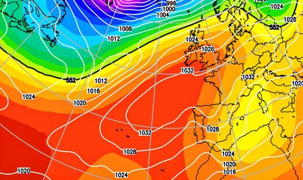
The most popular heatmap most people have seen is a literal heatmap – showing how temperature varies over different places.
This is an example weather forecast from the Daily Express showing the expected temperatures as a heatmap. This makes it easier to visualize which places will be hot, cold, or in between.
Showing Website/App Usage

Through tracking mouse movements, clicks, and scrolling patterns, heatmaps help identify popular or neglected areas of a webpage. This can then be used to optimize user interfaces and enhance user experience.
Medical Imaging
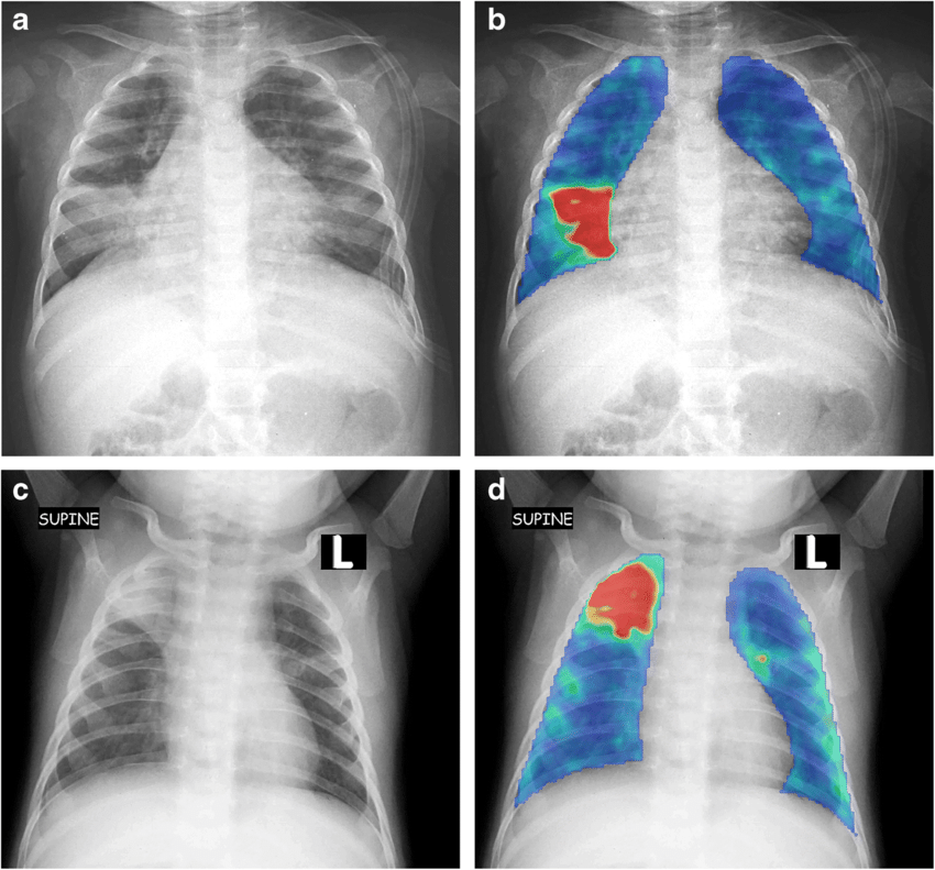
Heatmaps visualize areas of high or low activity in the body. This can identify anomalies and diseases and assess the progression or response to treatment in conditions like cancer.
Libraries for Creating Heatmaps in Python
Python is a popular language for data analysis and visualization. This is because of its simple syntax and extensive ecosystem. There are multiple libraries that you can use to create heatmaps in Python. These include:
- Matplotlib – A popular data visualization library. It is a low-level library that provides more customization options but is complicated.
- Seaborn – This visualization library is built on top of Matplotlib and simplifies some of its functions while providing better-looking visualizations.
- Plotly – This is a visualization library that provides an easy-to-use API for creating Heatmaps in Python.
In the next section, we will explore how to create heatmaps using all of these libraries.
How to Generate a Heatmap?
In this section, I will explore how to create heatmaps using Matplotlib, Seaborn, and Plotly. To code, I am going to be using Google Colab. It is a free-to-use instance of a Python Notebook that uses Google Infrastructure to run your code. It requires no setup, so you can also use it to follow along. To begin, we will cover Matplotlib first.
Matplotlib
To begin, we start by importing the Matplotlib library.
import matplotlib.pyplot as pltWe will also need NumPy to generate a random dataset.
import numpy as npTo generate the dataset, we will add the following code:
# Creating a seed for reproducibility
np.random.seed(2)

# Generating 10 x 10 array of integers between 1 and 50
data = np.random.randint(low = 1, high = 50, size = (10, 10))
To plot the data, we use the imshow method. We pass in data as the argument. We can do more by passing on additional arguments we will get into later.
plt.imshow(data)If you run the cell, you should see a heatmap.
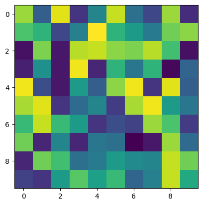
While this is great, there are many customization options available to you. For starters, you can change the color used in the image using the cmap argument that you pass to imshow. For example, if you wanted to change the color used by the heatmap to different shades of blue, you would generate the plot with the following.
plt.imshow(data, cmap = 'Blues')The full list of cmap options is found here. Anyway, the result of the above would be:
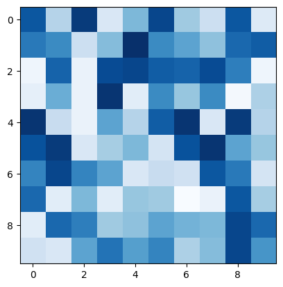
A heatmap would be more useful if there were a key to explain what the colors represented. To do this, add the following code:
plt.colorbar()After this, you should get a figure that looks like this:

A color bar is useful, but in some cases, you may want to annotate the different values so the viewer may see precisely what is represented. To do this, you would write text in each of the cells using plt.text().
for i in range(data.shape[0]):
   for j in range(data.shape[1]):
      plt.text(j, i, '%d' % data[i, j],
         horizontalalignment='center',
         verticalalignment='center',
      )
The last thing we will do with the heatmap is to set the tick labels on the axes. We will use the plt.xticks function for the x-axis and plt.yticks function for the y-axis. These methods are called the same way; the only difference is the axis each method affects.
The first argument is the list of places to insert ticks. This is represented as an array of indices. The following argument is the actual list of labels that would be inserted. Here’s an example of how we would insert ticks:
x_labels = ['A', 'B', 'C', 'D', 'E', 'F', 'G', 'H', 'I', 'J']
y_labels = ['a', 'b', 'c', 'd', 'e', 'f', 'g', 'h', 'i', 'j']

plt.xticks(np.arange(len(x_labels)), labels=x_labels)
plt.yticks(np.arange(len(y_labels)), labels=y_labels)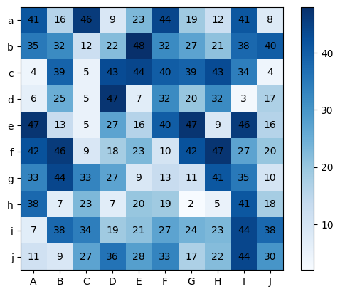
And that’s it! That is how you create a heatmap in Matplotlib. The complete code solution is detailed below.
import numpy as np
import matplotlib.pyplot as plt

# Creating a seed for reproducibility
np.random.seed(2)

# Generating 10 x 10 array of integers between 1 and 50
data = np.random.randint(low = 1, high = 50, size = (10, 10))

# Creating a plot with blue as a color
plt.imshow(data, cmap = 'Blues')

# Displaying a color bar
plt.colorbar()

# Annotating values
for i in range(data.shape[0]):
   for j in range(data.shape[1]):
      plt.text(j, i, '%d' % data[i, j],
         horizontalalignment='center',
         verticalalignment='center',
      )

# Creating lists of tick labels
x_labels = ['A', 'B', 'C', 'D', 'E', 'F', 'G', 'H', 'I', 'J']
y_labels = ['a', 'b', 'c', 'd', 'e', 'f', 'g', 'h', 'i', 'j']

# Adding the tick labels
plt.xticks(np.arange(len(x_labels)), labels=x_labels)
plt.yticks(np.arange(len(y_labels)), labels=y_labels)
However, using Matplotlib is not the easiest solution. As we will see next, other libraries, such as Seaborn and Matplotlib, simplify the process of building a heatmap.
Seaborn
In this section, we will recreate the previous example using Seaborn. Seaborn is a library that builds on top of Matplotlib. It provides abstractions that make it easier to work with. To create a heatmap, we start by importing the libraries we are going to use.
import matplotlib.pyplot as plt
import numpy as np
import seaborn as sn
We imported Matplotlib because Seaborn requires it. Next, we also need to import NumPy to generate a random dataset. Lastly, we have to import Seaborn.
Next, we generate the dataset using NumPy.
# Creating a seed for reproducibility
np.random.seed(2)

# Generating 10 x 10 array of integers between 1 and 50
data = np.random.randint(low = 1, high = 50, size = (10, 10))
After doing this, we create our lists of tick labels.
# Tick labels
x_labels = ['A', 'B', 'C', 'D', 'E', 'F', 'G', 'H', 'I', 'J']
y_labels = ['a', 'b', 'c', 'd', 'e', 'f', 'g', 'h', 'i', 'j']
Then lastly, we create the actual heatmap by calling the heatmap function of the sn module.
hm = sn.heatmap(data = data, cmap = 'Oranges', annot = True, yticklabels = y_labels, xticklabels = x_labels)As you can see, we passed several arguments. Here’s an explanation for each:
datais the dataset we want to plotcmapis the color scheme we want the heatmap to e created usingannotstates whether we want to annotate the data points with their actual valueyticklabelsis the list of labels we want for the vertical axis ticksxticklabelsis the list of labels for horizontal axis ticks.
Lastly, we show the plot using the code:
plt.show()This will generate the following heatmap:
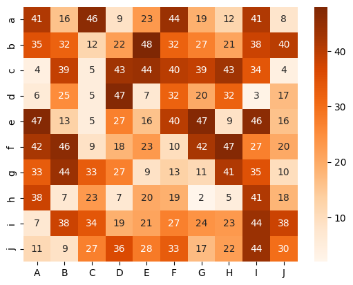
Plotly
For Plotly, the process is similar to Seaborn. Here is the code outline for creating a heatmap in Plotly:
import plotly.express as px
import numpy as np
# Creating a seed for reproducibility
np.random.seed(2)
# Generating 10 x 10 array of integers between 1 and 50
data = np.random.randint(low = 1, high = 50, size = (10, 10))
# Tick labels
x_labels = ['A', 'B', 'C', 'D', 'E', 'F', 'G', 'H', 'I', 'J']
y_labels = ['a', 'b', 'c', 'd', 'e', 'f', 'g', 'h', 'i', 'j']
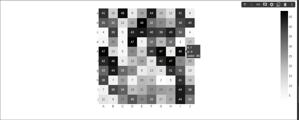
px.imshow(data, text_auto = True, x = x_labels, y = y_labels, color_continuous_scale= 'greys')As you can see, the heatmap is generated in the last line using the px.imshow() function. This function takes in the data to plot as a positional argument. In addition, it takes keyword argument as follows:
text_autois a boolean that enables the annotation when set to truexis a list of x-axis tick labelsyis a list of tick labels on the y-axiscolor_continuous_scaledetermines the color scheme used for the graph.
As you can see, Plotly is simpler than Seaborn and Matplotlib. In addition, the graph generated is interactive compared to other libraries that produce static images.
Here’s the final result screenshot:
Final Words
In this article, we covered how to create heatmaps in Python. We covered the main libraries – Matplotlib, Seaborn, and Plotly. We also saw how Seaborn and Plotly provide simplified abstractions over Matplotlib. One critical use of Heatmaps is tracking how people use your websites.
Next, check out heatmap tools that tell you where your users are clicking.